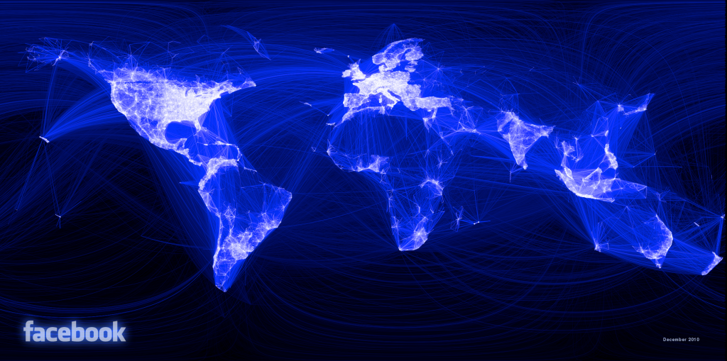
On my daily blog/media run to different websites I came across above image.
Facebook intern, Paul Butler, created this map because he wanted to see “how geography and political borders affected where people lived relative to their friends.” Paul took data from nearly ten million pairs of friends from as well as their current city and then converted their cities to longitude and latitude. Then added a weighted line to each friend’s city so that the lines would overlap creating a dull or bright light depending on the amount of friends from the given city. A more in depth look into Paul Butler’s logic can be found here . A high-res image can be found here (click or right click to save).
